analysed on 22 October 2026
What the Site Is AboutPretty Petals 4 U is a local independent florist based in Derby. The site promotes fresh flower arrangements and related celebration services, with a focus on weddings, funerals, events and everyday occasions. Customers can enquire about bouquets, same-day flower delivery, balloon arrangements, venue decoration and prop hire.The business also highlights specialist services, including Asian wedding flowers and Traveller funeral tributes, as well as dried and silk arrangements, hat box designs and personalised balloons. Its stated aim is to provide quality, creative floristry and event services with personal advice and value for money. Good Points and Trust Signals - Clear business details: The site provides a street address at Shop 29, Rosehill Business Centre, Derby, DE23 6RH, plus mobile and landline telephone numbers.
- Opening hours: It states that the shop is open Monday to Saturday, 10:00am–6:00pm, and gives a mobile number for enquiries outside those hours.
- Local experience: The business describes itself as an independent Derby florist established over 11 years ago.
- Service information: Visitors can see the main types of flowers and event services offered, including wedding and funeral work, party planning, venue styling and prop hire.
- Delivery information: Same-day delivery is promoted, with a stated 2:00pm order cut-off.
- Quality and sourcing claims: The florist says it uses fresh flowers from trusted growers, including Dutch and English-grown flowers, and that its dried flowers are responsibly sourced.
- Personal assistance: The site encourages customers to call for guidance, which is especially useful for bespoke wedding and funeral arrangements.
No customer testimonials, review ratings, professional memberships or payment/security assurances are included in the supplied text, so visitors have limited independent evidence of customer satisfaction. Improvements to Help Visitors - Make ordering steps clearer: Explain how to place an order, whether online ordering is available, what payment methods are accepted and how customers receive confirmation.
- Clarify delivery coverage and terms: List the postcodes served, delivery charges, delivery time windows and any limits or exceptions to same-day delivery.
- Add product details: Provide prices or typical price ranges, bouquet sizes, available options and clear information about substitutions when particular flowers are unavailable.
- Explain bespoke services: Give wedding, funeral, event and prop-hire customers a simple outline of the enquiry process, lead times and what details to prepare for a quote.
- Build confidence with evidence: Add genuine customer reviews, examples of completed work, and any relevant business credentials or guarantees.
- Improve clarity and consistency: Correct spelling and grammar errors, remove repeated promotional text and unfinished template labels such as “TitleDescription.” Confirm the copyright date and keep business details consistent.
- Publish practical policies: Include cancellation, refund, freshness and care information, along with an explanation of how the business handles delivery problems or customer complaints.
analysed on 21 October 2026
What the site is about and its purposeTrusted Shops is a platform intended to make online shopping safer and help shoppers choose online retailers. It offers three main services: a Trustmark for qualifying shops, Buyer Protection for eligible purchases, and reviews to help people assess shops and products. Visitors can search for shops, learn about fake shops, and create an account to view orders, protections and reviews. Retailers can also log in to manage their reviews, buyer protections and settings.The site also promotes selected online shops, including businesses selling pharmacy products, jewellery, car accessories and professional equipment. Its broader purpose is to connect shoppers with retailers that meet its standards and provide reassurance if an order goes wrong. Good points and trust signals - Buyer Protection: The site describes a money-back guarantee for eligible purchases up to £2,500 and says protection applies regardless of payment method. It addresses common concerns such as missing parcels and refunds.
- Trustmark standards: Trusted Shops says approximately 25,000 shops have earned its mark by meeting or exceeding requirements for personal-data security and customer service.
- Substantial review base: The site refers to more than 160 million trustworthy reviews and explains that shoppers can use experiences relating to service, delivery and products.
- Shop examples and search: Named retailers are presented with short descriptions and website addresses, giving visitors concrete examples of businesses in the scheme.
- Account features: Shopper accounts bring orders, protections and reviews together, while retailer accounts support the management of reviews and protection services.
- Company and policy information: The text includes links for the company, press, jobs, legal notice, privacy, data protection, cookies and platform terms. A whistleblowing channel is also listed.
- International coverage: Country options indicate that the service operates across several European markets.
Improvements that could help visitors - Explain protection in practical steps: Set out how to activate protection, make a claim, provide evidence and receive a refund. Clarify any fees, exclusions, deadlines and whether protection is automatic or requires registration.
- Make Trustmark checks transparent: Summarise the assessment criteria, how often shops are reviewed, and what happens when a retailer no longer meets the requirements. A clear way to verify a shop’s current status would increase confidence.
- Provide more detail on review authenticity: Explain how reviews are collected, checked and moderated, and how suspected fake or biased reviews are handled.
- Reconcile the shop figures: The page mentions both about 25,000 Trustmark shops and 32,000 safe online shops. Explain what each total represents and when it was last updated.
- Make company contact details easier to assess: The supplied text points to a legal notice but does not show a physical address or direct support contact. Displaying clear contact details and expected response times would help visitors seeking assistance.
- Add customer evidence: The page promotes reviews but does not show individual shopper testimonials in the supplied content. A few dated, attributed examples could illustrate how Buyer Protection works in practice.
- Clarify retailer costs: Pricing is referenced, but no prices or service-plan details appear in the supplied text. A concise explanation would help businesses understand the offer.
analysed on 20 October 2026
What the Site Is AboutBraham Opticians is an independent optician serving London, based at 92 Church Street, London, NW8 8EX. The practice says it has served the community since 1969. Its purpose is to provide eye examinations and other clinical eye-care services alongside a curated range of designer and independent eyewear.The services described include routine eye tests, children’s eye care, myopia management, contact lens fitting and aftercare, OCT and retinal imaging, the NHS Minor Eye Conditions Service (MECS), eyelid treatments, and same-day glasses for selected prescriptions. The site also helps visitors understand NHS-funded eye-test eligibility, optical insurance benefits and support for some international patients. Visitors can contact the practice by phone, email or WhatsApp, or book an eye test. Good Points and Trust Signals - Established local practice: The site gives a clear founding date—1969—and presents the business as an independent London optician.
- Physical address and contact details: It publishes its Church Street address, phone number, email address and opening hours, helping visitors assess whether the practice is convenient to visit and how to get in touch.
- Broad, clearly described care offering: Visitors can see that the practice provides both routine and more specialised services, including myopia management, diagnostic imaging, MECS and contact-lens care.
- NHS information: It outlines several groups who may qualify for an NHS-funded eye test and describes MECS as a service that does not require a GP referral. This helps visitors understand possible care routes.
- Review signals: The page displays a 4.9-star Google review signal and includes short patient comments about service, speed and frame choice.
- Insurance information: Allianz, Bupa and AXA are named, with a useful qualification that benefits depend on eligibility or plan approval.
- Practical reassurance: The site mentions personal appointments, modern equipment, same-day glasses for selected prescriptions, and the option to ask the team about NHS eligibility.
Improvements to Help Visitors - Correct the damaged text and encoding: Many words, prices, names, symbols and testimonials appear corrupted or incomplete—for example, the phone number, frame listings and review quotes. These errors make important information difficult to trust or use. Check the page content and character encoding throughout.
- Make review evidence verifiable: State whether the 4.9 rating is current, how many reviews it represents, and when it was last checked. Ensure quotations are complete, accurately attributed and linked to their source where appropriate.
- Clarify service details: Explain which services need an appointment, who can use MECS, what “same-day” glasses depends on, and whether OCT, BlephEx or ZEST involve extra charges.
- Give visitors clearer cost and eligibility guidance: Add indicative prices where possible and explain how patients can confirm NHS, insurer or international allowance eligibility before attending.
- Strengthen professional credentials: Identify the optometrists and relevant qualifications or registrations, and explain how clinical information and patient data are handled.
- Complete product information: Provide accurate frame names, prices, availability and image status so visitors can assess products before contacting the practice.
analysed on 19 October 2026
 What the Site Is AboutCresta Dry Cleaners & Laundry is a Cambridge cleaning business serving domestic and commercial customers. The site explains that the business has operated for over 60 years and performs dry cleaning and laundry on-site, positioning its service as traditional, reliable and convenient. Its stated purpose is to help visitors understand the available services, check practical details and contact or visit the shop.Services include dry cleaning for garments and household items, bedding and linen laundry, workwear cleaning, wedding dress cleaning and preservation, curtain cleaning, and garment repairs and alterations. The site also refers to support for guest houses, Airbnb hosts and hospitality businesses. Good Points and Trust Signals - Long-standing experience: The claim of more than 60 years in business gives visitors a useful indication of experience, particularly for specialist work such as wedding dress cleaning.
- On-site service: The site says cleaning is performed on-site, which helps explain how the business aims to provide a fast and reliable service.
- Clear contact and location details: A street address in Chesterton, Cambridge, and a local phone number are provided, making it easier to visit or call.
- Useful visit information: Opening hours are listed, along with free parking and a what3words location reference.
- Broad service range: The business describes services for both households and commercial customers, including specialist and everyday cleaning needs.
- Specific service details: Wedding dress preservation boxes, curtain items accepted and examples of repairs help visitors understand what the business can handle.
Improvements to Help Visitors - Resolve inconsistent contact details: The page shows both 555-555-5555 and 01223 358647, as well as mymail@mailservice.com. Confirm which phone number and email address are genuine, then use the correct details consistently. Placeholder-looking contact information could reduce confidence.
- Publish prices or explain quotations: Although prices are referenced, no rates are included in the supplied content. Add example prices for common items, or explain how customers can request a quote and what information is needed.
- Set expectations about turnaround: “Fast” service is mentioned, but visitors are not given typical completion times. Provide estimated turnaround times and explain whether urgent services are available.
- Clarify collection arrangements: A “Collections” section is referenced, but the text does not explain whether this means customer collection from the shop or a pickup-and-delivery service. State the options, areas covered and any fees.
- Add customer evidence: Testimonials, review excerpts or links to independent review profiles would help visitors assess service quality. No reviews, ratings or customer examples appear in the supplied content.
- Explain specialist-care processes: Briefly describe how delicate items are assessed, what wedding dress preservation includes, and any limitations or risks customers should know about before handing items over.
- Improve practical contact guidance: Explain the best way to ask questions or request commercial-service information, and clarify holiday opening arrangements.
analysed on 17 October 2026
What the Site Is AboutPhoto Fix Team offers outsourced photo editing for eCommerce businesses, product photographers, studios, and agencies. Its services include background removal, clipping paths, product retouching, color correction, apparel editing, ghost mannequin effects, and jewelry retouching. The company says it prepares images for Amazon, Shopify, Walmart, Etsy, eBay, WooCommerce, and other online stores, with the aim of helping customers create consistent product listings and manage large image workloads.The site explains a three-step process: submit sample images and instructions, review and approve the edits, then upload a larger batch for processing. It also provides marketplace image guidance, service descriptions, pricing starting points, and answers to common questions. Good Points and Trust Signals - Clear service scope: The site describes a broad range of editing services and identifies the types of customers and products they suit.
- Free sample offer: Visitors are invited to submit images and review edited work before committing to a full order.
- Pricing information: Starting prices are shown for basic cleanups and complex retouching, with a link to more detailed pricing.
- Process and turnaround claims: The site outlines how orders are handled and promises fast delivery, quality checks, and revisions.
- Privacy assurances: It says customer images will not be reused or shared, and that an NDA is available on request.
- Relevant expertise: Marketplace-specific guidance and a requirements table demonstrate familiarity with common listing-image rules.
- Examples of results: The site shares case-study figures for click-through rates, page speed, and returns, although their evidence could be clearer.
- Useful FAQs: Answers address practical questions about image formats, marketplace requirements, clipping paths, and editing services.
Improvements to Help Visitors - Correct text errors: The supplied content contains broken characters, misspellings, incomplete words, and duplicated text. Proofreading and fixing encoding issues would make the information easier to understand and appear more reliable.
- Reconcile service promises: Turnaround is variously stated as 1–24, 12–24, 12–48, and 2–48 hours, while other sections promise delivery in less than 24 hours. State a consistent standard and explain how volume or complexity affects timing.
- Clarify the sample offer: The page refers to three to five free edits, up to ten uploaded images, and one or two sample images. Explain exactly how many free edits are included and whether limits or conditions apply.
- Explain pricing fully: Provide the full rate card, volume discounts, minimum order size, and any extra charges. Define what each price tier includes.
- Strengthen proof of results: Add named or anonymized client examples, dates, measurement methods, and context for the published performance figures. Include genuine customer testimonials if available; the supplied content does not show specific quoted testimonials.
- Make contact and security details explicit: The content mentions a contact page but gives no email, phone number, business address, or detailed security and file-retention practices. Providing these details could help visitors assess the business and share files with confidence.
- Resolve workflow differences: Explain whether final files arrive through a secure dashboard or external file-sharing services, and describe how revisions and quality checks are handled.
analysed on 16 October 2026
What the Site Is AboutAlbright appears to be a fashion- or design-related business offering services connected with designers, clients and selected products or recommendations. The site includes sections titled “Designers,” “Selection,” “Albright Recommends” and “Fit File,” suggesting it helps visitors discover designers, explore a curated offering and learn about Albright’s expertise. However, the supplied text does not explain exactly what services are provided or who they are intended for, so visitors may need more detail before deciding whether Albright is right for them.The site also provides information for clients and the press, including a service agreement, a press room, news and an archive. Its purpose appears to be introducing the business, presenting its work and contacts, and supporting relationships with clients, designers and media. Good Points and Trust Signals - Physical address: Albright lists its location as 32 Cooper Square, giving visitors a specific place to associate with the business.
- Appointment details: The site states that visits are by appointment only and provides weekday hours: Monday through Friday, 9 a.m. to 6 p.m. This sets clear expectations about visiting.
- Telephone contact: A phone number, 212-253-5894, gives visitors a direct way to get in touch.
- Professional context: Dedicated sections for designers, clients and the press indicate that the business serves identifiable professional audiences.
- Press information: “Mentioned in,” “Latest News” and “Archive” sections could help demonstrate media coverage and provide evidence of the business’s activity.
- Client information: A “Clients” section may help establish experience, although the supplied text does not reveal which clients are listed or include their feedback.
- Social accounts: Facebook and Twitter are named as additional channels through which visitors may be able to follow or contact Albright.
- Business documentation: The service agreement indicates that terms are addressed, which can help set expectations for clients.
Improvements Albright Could Make - Explain the offer clearly: Add a concise description of Albright’s services, the types of clients it serves and what a typical engagement involves.
- Clarify specialist terms: Explain what “Fit File” means and how the “Selection” and “Albright Recommends” features can help visitors.
- Make the next step explicit: Tell prospective clients how to arrange an appointment, what information to provide and whether initial enquiries are welcome by phone or email.
- Complete contact information: The supplied text ends with an incomplete “or” after the phone number. Ensure the full contact details, including a working email address if available, are clearly stated.
- Build confidence with evidence: Where permission allows, provide client examples, project outcomes or attributed testimonials. A client list alone may not explain the value of the work.
- Keep updates useful: Include dates and context with news and press mentions, and maintain the archive so visitors can assess how current the information is.
analysed on 15 October 2026
1) What the website is about & its purposeThe site appears to be a photography portfolio for Jaime Vedres, showcasing work across portraits, architecture, commercial, industrial, and music. The purpose is to display selected client work and featured subjects (including musicians, actors, and local public figures) and to encourage visitors to contact the photographer for bookings or inquiries.2) Good points / trust signals - Clear author/brand identity: “Jaime Vedres Photography” is repeatedly referenced alongside multiple photographer credits (e.g., Nashville-Calgary connections).
- Credibility via awards: “Ron Sakamoto is a multi-award-winning music promoter…” indicates association with recognized industry figures.
- Relevant specialty positioning: The site highlights photography categories that match likely business needs (commercial, industrial, architecture, music, portraits).
- Large gallery of named subjects: Many individual people and roles are listed (e.g., actors, musicians, mayor, broadcaster/CBC mention), suggesting real commissioned work rather than generic stock.
- Copyright ownership statement: “All Photos are Copyright © Jaime Vedres Photography. All rights reserved.” is an explicit rights and authenticity signal.
- Contact details provided: Email (jaime.vedres@gmail.com) and phone ((403) 715 - 0669) are clearly shown.
3) Improvements to help visitors - Add a clear “services” summary (what visitors can book): e.g., headshots, commercial/brand photography, event/music portraits, architecture/industrial shoots, turnaround times, and deliverables.
- Provide pricing guidance (even ranges) or common packages to reduce uncertainty and increase inquiry conversions.
- Include testimonials or client quotes (names + role/company) to strengthen social proof beyond featured subjects.
- Clarify location & coverage: specify where the photographer is based and the regions served (e.g., Alberta, Calgary, Lethbridge, travel availability).
- For each featured image/series, add context: client name/company (where permissible), project type, date/year, and a 1–2 line story about the assignment.
- Make the inquiry process explicit: add a short call-to-action text like “Request a quote” and list what information to include (date, usage, number of images, deadline).
- Correct and standardize the text content: there are repeated lines and some mixed naming/labels (e.g., partial duplicates and “Musican” spelling). Cleaner wording helps visitors trust professionalism.
- Add an “about/experience” section with measurable details: years of experience, awards (with specifics), equipment approach, and client industries.
analysed on 12 October 2026
1. What the site is about and its purposeThe provided content after the double colon is: “local_rate_limited”. This text typically indicates a system response meaning requests are being limited due to rate constraints (e.g., too many requests in a short period, or throttling rules applied to protect a service). Based on only this snippet, the website/service appears to be an API-backed or automated-access platform rather than a page describing a business, products, or services in a conventional way.2. Good points / trust signals foundFrom the text provided, there are no explicit trust signals present. Specifically, the snippet does not include information such as: - Company name, brand identity, or clear purpose statement
- Physical address or business registration details
- Testimonials, reviews, or customer case studies
- Contact methods (phone, email, contact form details)
- Security or compliance indicators (e.g., SSL/certificates, privacy policy references, trust badges)
- Clear messaging about service availability, support, or how to resolve access issues
3. Improvements the site can make (based on what’s visible)The content shown looks like an error/throttling label rather than helpful information for visitors. The biggest improvement would be to present a user-friendly explanation when rate limiting occurs. - Replace the raw error label with a helpful message: Explain that requests are temporarily limited and that the visitor can try again later.
- Provide an estimated wait time: If possible, include “Try again in X minutes” or include a retry-after style value.
- Offer guidance for different users: For example, if this affects developers/API clients, provide links to API documentation, rate limits, and best practices (e.g., exponential backoff).
- Include a clear support path: Provide contact information or a support link when throttling persists.
- Use status-context wording: Clarify whether the limit is per-IP, per-account, or per session, so legitimate users understand why they were blocked.
- Avoid showing internal/system terms: “local_rate_limited” reads like a backend status. Converting it into plain language improves usability and reduces confusion.
Overall conclusion: With only the “local_rate_limited” text available, the site/service appears to be returning a throttling response rather than meaningful visitor content. Improving error handling and adding user guidance would be the most important enhancement for helping visitors understand what happened and what to do next.
analysed on 10 October 2026
1. What the site is about (purpose)This website is for a wholesale flannel clothing manufacturer and distributor, focused on supplying bulk flannel apparel for retailers, business owners, and bulk buyers. It promotes products such as men’s and women’s flannel shirts, plaid flannel shirts, flannel jackets, jumpsuits, tees, nightwear, and even home textiles (e.g., bed sheets/blankets). The site’s primary purpose is to generate leads for free quotes and sample requests, including customization/private label and distributor inquiries.2. Good points / trust signals found - Clear business identity: “celebrated flannel clothing manufacturer” and “Wholesale Designer Flannel Clothing Manufacturer” messaging.
- Manufacturing longevity claim: “WE EXCEL IN MANUFACTURING SINCE 2004”.
- Extensive product catalog positioning: references to “800+ Products”.
- Geographic footprint: mentions operations across the USA, Australia, Canada, and also lists offices in multiple regions (Los Angeles/Beverly Hills, Sydney, Dubai, London).
- Full office addresses shown, including:
- Los Angeles (HQ): 8730 Wilshire Blvd, Beverly Hills, CA 90211, USA
- Sydney office address in Australia
- Dubai office address in Business Bay
- London address: Buckingham Gate / Catherine Place area
- Direct contact details: phone numbers, and multiple email addresses (e.g., info@flannelclothing.com, sales@diozgroup.com).
- Multiple communication options: “Contact Form”, “Call”, “Email”, “WhatsApp Chat”.
- Quote/sample calls-to-action: “Request Free Quote”, “Request Sample”, and “Quote Now” prompts.
- Corporate grouping reference: “A UNIT OF DIOZ GROUP”.
- Copyright and year range: “2011 - 2026”, suggesting ongoing operation.
3. Improvements to help visitors - Add proof-based credibility: The text provides claims (quality, experience, licensing, worldwide network) but no concrete evidence (certifications, compliance standards, manufacturing capabilities, inspection/testing details). Add verifiable items (e.g., fabric/production certifications, quality control process, sustainability documentation).
- : The page text does not show testimonials. Add buyer testimonials, partner stories, or repeat-client stats (e.g., “X retailers served”, “Y years with distributors”).
- : There is a quantity/country selection area, but key buying requirements aren’t stated clearly in the visible text (MOQ, production timeline, shipping timelines, payment terms, customization lead times).
- : Many product names are listed, but visitors would benefit from standard product spec blocks (materials used per item, size range, color options, care instructions, and what’s included in bulk/custom orders).
- : Add specifics about sustainability (what is eco-friendly, what materials are used, what “sustainable” means, and any third-party verification).
- : Multiple emails and regional offices are listed; add which department handles what (samples vs quotes vs private label vs distributor applications) to speed up inquiries.
analysed on 8 October 2026
What the site is about (purpose)The content is from Dorothy Perkins (DP), an online fashion retailer. The site’s purpose is to help visitors shop women’s clothing and accessories by category (e.g., dresses, coats, knitwear, shoes, home, beauty, gifts) and by preferences such as sale offers, new arrivals, fit (petite/plus/tall), and occasion. It also promotes a photo-based “visual search” feature that lets shoppers find similar items by uploading or photographing products.Good points / trust signals - Clear brand purpose statement: explains the store’s focus on “effortless, everyday pieces,” collections, and versatile styling.
- Visual search tool: includes a “quick and easy” workflow (“Upload or take a photo to find similar products”). This helps users find what they want faster.
- Sales/promotions transparency: repeatedly lists discounts (e.g., “Up To 70% Off,” “Up To 50% Off,” “15 & Under”) and delivery thresholds.
- Customer service and policy links are present in the content:
- Contact Us
- Returns Information
- Delivery Information
- Frequently Asked Questions
- Privacy Policy, Terms & Conditions, About Cookies
- Customer payment/trust options: mentions multiple recognized payment methods such as PayPal, Klarna, and Clearpay, plus card options and branded payment references.
- Ongoing commercial legitimacy indicators: “COPYRIGHT © 2026 DOROTHY PERKINS” suggests an established, maintained brand presence.
- About and compliance/ethics references: includes links such as About Cookies, Modern Slavery Statement, and Privacy & Legal.
Improvements to help visitors - Add explicit, prominent “how it works” details for Visual Search (e.g., supported image formats, what happens after upload, whether results are exact or “similar,” and average result time).
- Reduce repetition and improve scannability of key messages: the provided text is dominated by long category listings and repeated promotions; summarizing the most important offers and benefits above-the-fold would help users find relevant information quickly.
- Strengthen trust content that is currently missing in the text: no testimonials, ratings, or review evidence appears in the provided content. Adding structured product reviews/testimonials can increase confidence.
- Provide clearer shopping filters in text: the content suggests many categories and fit types, but visitors would benefit from a concise list of filter options (e.g., “Petite/Plus/Tall,” “Occasion,” “Budget,” “Seasonal trends”) and what each filter does.
- Clarify delivery promise wording: it mentions “Free Delivery On Orders Over £50” and “Unlimited Delivery,” but visitors would benefit from a single clear summary of delivery speed options, costs, and coverage.
analysed on 6 October 2026
What the website is about (purpose)The site is an e-commerce and content platform for a small, slow-fashion brand based in Oslo, Norway. It sells digital sewing patterns and also references ethically made garments (e.g., the “Aphrodite” underwear set made in 100% linen). The primary purpose appears to be helping visitors create their own clothing by purchasing downloadable PDF patterns, with an emphasis on being size-inclusive and “ethically produced.”Good points / trust signals - Clear product focus: multiple sewing patterns listed with specific names and pricing, including “Digital product - instant download,” which clarifies how the purchase works.
- Instant delivery model explained: “PDF Download” and “instant download” reduce uncertainty for buyers.
- Size-inclusive claim with concrete range: the Darcy Bloomer pattern explicitly states sizes 2XS–6XL and notes that larger sizes are created using plus size standards.
- Ethics and sourcing messaging: the brand describes garments as “ethically produced” and mentions “Together with Fair & Square” for the Aphrodite set.
- Specific product contents listed: print formats (A4, A0, US Letter) and included sizes are shown for the pattern.
- Credibility via social proof: products are “Styled by” a named creator (@scandinavianabroad), and the site links to social platforms (Instagram, YouTube, TikTok, Pinterest).
- Company transparency: the brand is described as “a small, slow fashion brand from Oslo, Norway.”
- Support and policies present: Contact Us is included, plus Privacy Policy, Terms of Service, and Refund Policy, which are important trust components.
- Store information & purchasing context: “View store information” and checkout-related elements indicate a functioning commerce workflow.
Improvements to help visitors - Add clearer guidance for first-time pattern buyers: a short “How downloads work” section (what happens after purchase, file access, printing steps, and where to find downloads) beyond “instant download.”
- Expand fit and sizing instructions: provide a link or checklist for choosing sizes (e.g., body measurements, ease guidance, and how the “plus size standards” approach affects pattern sizing).
- Strengthen trust with testimonials/reviews: the page content includes styling credits and social links, but no explicit testimonials, reviews, or user success stories are visible in the provided text.
- Improve pattern comprehension: for each pattern, include consistent “difficulty level,” recommended experience (beginner/intermediate), skill requirements, and estimated sewing time.
- Clarify shipping/pickup expectations: the text mentions “Pickup currently not available.” Since patterns are digital, ensure the digital workflow is unambiguous and remove or explain irrelevant fulfillment messages.
- Make policy summaries easier to scan: include short, plain-language summaries (e.g., refund rules for digital downloads) near the purchase area.
- Add direct help content: a printable FAQ for common issues (printing accuracy, A0/A4 options, tape testing) and links to tutorials.
analysed on 2 October 2026
1. What the site is about & its purposeFashFashExplore (referred to as Fash) is a platform that helps people find, compare, and book local service vendors for many occasions. The site covers categories such as hair salons, photographers, weddings, catering, limo rental, and alterations, offering a way for users to get free cost estimates, view vendor profiles and reviews, and then contact and hire the right provider. It also includes a business/pro offering for vendors to get more customers and leads.2. Good points / trust signals - Free cost estimates: “Get free cost estimates” and “We track the estimates… then we share those prices… for free.” This helps set expectations before hiring.
- Transparent pricing examples: Explicit mentions of categories like tattoo prices, photography pricing, limo rental cost, wedding cake cost, catering cost, and more.
- Vendor comparison tools: Users can compare profiles, read reviews, check qualifications, and see prices before hiring.
- Clear hiring workflow: Prompts to ask questions, confirm availability, and hire when ready.
- Social proof rating: “Excellent 5/5” with an About Fash section that suggests credibility.
- Geographic coverage: Lists “Top cities” and “Find vendors in all 50 states,” indicating breadth of availability.
- Business-to-vendor program: Mentions delivering “highly qualified leads,” controlling budget, declining leads, and “Win more jobs.” This suggests a defined vendor service model.
- Company information & policies: Includes About, Press, Contact us, and legal/compliance pages like Terms of Use, Privacy Policy, and Accessibility.
- Brand ownership visibility: Footer indicates “© 2026 Liaison, Inc.” which is a useful identity signal.
3. Improvements to help visitors - Add clearer proof details for reviews: The text mentions reviews, but doesn’t specify how reviews are collected (e.g., verified bookings) or whether they’re moderated—visitors would benefit from that transparency.
- Clarify what “qualifications” means: Specify which credentials are verified (licenses, insurance, portfolios, experience requirements) so users understand the level of vetting.
- Explain estimate methodology: The estimates are tracked and shared, but the site text doesn’t explain timeframes, whether estimates are range-based, or how vendors update pricing.
- Reduce ambiguity between categories and actions: Many sections list services (e.g., weddings subcategories). Consider adding short guidance like “What to expect after requesting an estimate” and response times.
- Increase clarity on booking outcomes: The “hire” flow is mentioned, but it’s unclear whether booking is finalized on-platform or via direct vendor contact—state the exact next step.
- Add user-facing help content excerpts: “Tips for hiring” and “Cost guides” are listed, but the text doesn’t show specific topics—include sample titles or categories to help visitors quickly find relevant guidance.
analysed on 29 September 2026
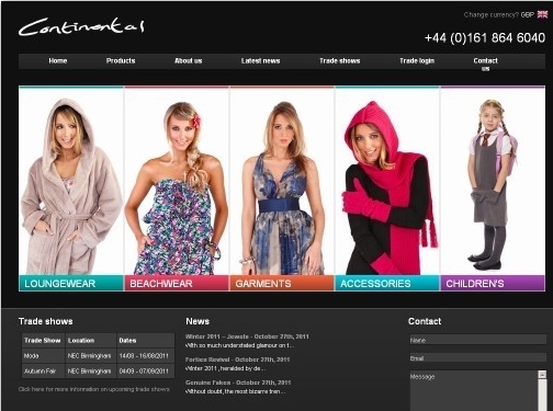 1. What the website is about & its purposeThis site is a wholesale e-commerce platform (“Welcome to our wholesale website”) focused on supplying trade customers with clothing and related products. It emphasizes fashion categories such as women’s and men’s clothing, swimwear/beachwear, loungewear/nightwear, winter items, knitwear, dresses, tops/bottoms, and accessories/footwear. The primary purpose is to help businesses register for a wholesale account and then browse wholesale products with wholesale pricing, including options for private label.2. Good points / trust signals - Wholesale-only positioning: “We ONLY sell to Trade.” This clarifies the audience and purchasing model.
- Minimum order requirement stated clearly: “Minimum order quantity is £500 + VAT.”
- Longevity and credibility: “70+ years experience” and “Established in 1953,” plus “family owned business you can trust.”
- Business capability claim: “We are an importer / exporter… supplying some of Europe’s biggest retailers, wholesalers, and independents.”
- Wholesale pricing access promise: “Quick access to wholesale pricing and low minimum quantities.”
- Product supply options: Offers stock and private label (“in house design team” and “private label on low MOQ’s”).
- Operational information: Mentions customer care items like Delivery & Returns and size guides (Men’s/Women’s/Children’s).
- Policy and compliance content: Links to Privacy Policy (and other account-related pages).
- Social proof potential: Linked social channels (Instagram, Facebook, LinkedIn) are present to verify brand presence.
- Account gating for trade: “Register for a Wholesale Account” indicates controlled access and business verification intent.
3. Improvements to help visitors - State how trade account approval works: Explain what documents are needed (e.g., business registration/VAT number) and typical approval time.
- Make pricing clarity more explicit: Confirm whether prices are visible only after login and whether shipping/fees are included or shown at checkout.
- Add concrete delivery details on the page: Provide clearer delivery timeframes, shipping regions, and how delivery costs are calculated (not just “Delivery & Returns” link labels).
- Private label specifics: Provide an at-a-glance private label process (lead times, artwork requirements, sample process, and typical MOQ examples).
- Improve “trust” evidence beyond claims: Include verifiable elements such as customer testimonials, partner logos/case studies, or named retailers/brands (if allowed).
- Clarify product catalog organization: Reduce ambiguity by briefly explaining what “Quick add” means (e.g., whether it adds to cart and whether wholesale pricing applies immediately after login).
- Reduce cookie prompt friction: Provide a short explanation of why cookies are used and ensure visitors can continue without unnecessary blocking.
- Address browser support message more directly: If the site requires specific browsers, communicate supported browsers and alternatives to reduce confusion.
analysed on 28 September 2026
1) What the site is about (purpose)The website appears to be for The Cut, a design-focused education academy. Its purpose is to inform prospective students about full-time and part-time programs, promote learning pathways in fashion and creative/graphic design, and generate leads through “Request Info”, Apply Now, and Enroll Now calls to action. It also shares news, blogs, a newsletter, and student-related materials such as testimonials and student support resources.2) Good points and trust signals (what works well) - Clear contact information: phone number (236)-477-4598 and email admissions@thecutdesignacademy.com.
- Admissions-oriented CTAs: “Request Info,” “Apply Now,” “Enroll Now,” and “Choose your path. Build your skills. Start Your Career Now.”
- Program transparency: named offerings such as Fashion Design & Creative Arts, Pattern Making & Assembling Technique, AI Integrated Graphic Design, Gerber Pattern Making & Grading, and certificates/diplomas.
- Multiple learning options: both Full-Time and Part-Time program categories are explicitly presented.
- Social proof: sections labeled Testimonials and Student Support suggest real student experiences and ongoing assistance.
- Content that supports decision-making: “What’s New?” bulletin/program highlights, Latest Blogs & Insights (e.g., career/skill topics like AI in fashion and graphic design), and a “Meet the Team” area.
- Newsletter with unsubscribe promise: includes “Unsubscribe anytime,” which supports user trust.
- Regulatory/credential signal: a “DLI# O142582255042” reference is shown, which can be important for verifying institution status for eligible students.
- Copyright/legal marker: “© 2026 The Cut” appears, supporting legitimacy.
3) Improvements to help visitors (based on the text) - Clarify key practical details: the text lists program names but doesn’t show program duration, tuition ranges, intake dates, admissions requirements, or credential outcomes (e.g., job placement support, internships).
- Strengthen credibility around testimonials: the presence of “Testimonials” is good, but visitors would benefit from seeing who is speaking (program studied, graduation year) and whether testimonials are from current graduates.
- Fix or refine incomplete/technical messaging: the newsletter section includes a note about a storage option (“This newsletter signup form needs a storage option…”). This kind of implementation text should not appear to visitors.
- Add more “student journey” guidance: include step-by-step instructions for how to apply, what happens after “Request Info,” required documents, and expected timelines.
- Make “Resources” more concrete: the presence of “FAQs,” policies, and student rights is valuable, but the site would benefit from surfacing the most important FAQs and policy highlights directly in the visible content.
- Provide clearer program outcomes: blog topics hint at career relevance—visitors would likely want explicit lists of typical roles/jobs, portfolio expectations, and skill focus per program.
Overall, the site strongly positions The Cut as an educational academy with program listings, lead-generation CTAs, and multiple trust indicators (contact info, testimonials, DLI reference, and policies). The biggest opportunity is adding more decision-critical details and removing any technical/unfinished copy visible to users.
analysed on 27 September 2026
1. What the website is about & its purposeThe site (“Towanda Womenswear”, also referencing “WEYRE Essentials”) is an e-commerce website selling contemporary women’s clothing. It focuses on “modern classic” and “seasonless” wardrobe essentials—flattering, everyday pieces made in Sydney, Australia—along with promotional sales (currently “HAPPY SALE 30% off everything”).2. Good points / trust signals (what’s working for visitors) - Clear product positioning: emphasizes everyday, wearable, “seasonless” essentials with flattering cuts.
- Transparent brand origin: states clothing is “designed and made in Sydney, Australia.”
- Promotion is explicit: “HAPPY SALE 30% off everything,” with wording that the discount is “automatically applied at checkout.”
- Shipping information provided: “Complimentary shipping on all orders within Australia.”
- Core policies are present: links for Shipping Policy, Refund Policy, Privacy Policy, and Terms of Service are included.
- FAQ availability: includes “FAQ,” which can reduce uncertainty for shoppers.
- Customer support is implied: the presence of “Contact Us” indicates support availability.
- Secure payment options indicated: lists major payment methods (e.g., Apple Pay, Google Pay, PayPal, Shop Pay, etc.), which can increase checkout confidence.
- Operational recency: footer shows “© 2026,” suggesting the site is maintained.
- Repeat engagement channel: mailing list signup encourages visitors to subscribe for updates.
3. Improvements to help visitors (based on the text provided) - Add missing trust elements: the content does not show testimonials, customer reviews, or a returns/how-to-contact detail beyond page links. Including actual testimonials and/or product reviews would strengthen credibility.
- Provide more concrete shopping guidance: include clearer sizing help in the visible product context (e.g., what “Sizing Information” covers, sizing fit notes, and how to choose between categories).
- Clarify sale mechanics beyond “auto applied”: specify any exclusions, sale end date, and whether all items/collections are included.
- Make shipping terms more specific: “complimentary shipping within Australia” is helpful—add expected delivery times and whether shipping is also available internationally (if applicable).
- Strengthen product detail in the listing: the page shows product names and sale pricing, but the text lacks key buying details (materials, fit notes, care instructions, fabric composition). Adding these would reduce returns and increase confidence.
- Improve contact transparency: “Contact Us” exists, but visitors benefit from clearer expectations such as response times and preferred contact method (email vs. form).
- Reduce ambiguity around multiple brands/collections: “Towanda Womenswear” and “WEYRE Essentials” are both referenced. Add a short explanation of the relationship (e.g., brand portfolio, collection names, or how they differ) to avoid confusion.
|
 Our web spider - powered with AI - can identify good and bad points of each site it visits. Below you'll find a random selection of sites our spider has recently visited, along with its notes on what it has found. The reason we show you these spider audits is to help give you ideas on how you can improve your own website.

